We help businesses and nonprofits thrive with custom-built technology.
- Engage your customers in new ways through dynamic websites.
- Solve your unique business challenges with desktop, mobile, and web apps.
- Captivate your audience with memorable interactive experiences.
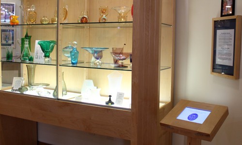
Ohio Glass Museum Kiosks
“Kosada was the perfect choice. They could not have been better to work with – professional, comfortable, and patient.”
– Mary Travis, Museum Spokesperson
Reach out to us
contact us
Contact us to get a free estimate.
postal mail
Kosada, Inc.
8620 Elliotsville Rd.
Athens, OH 45701
telephone
toll-free:
+1 (888) 8-KOSADA
(that's +1 (888) 856-7232)
fax
We can also receive faxes at our main number:
+1 (888) 8-KOSADA
We are proud to be a part of the Drupal Association
and the Athens Area Chamber of Commerce.